


Grid based layouts make organizing the information on a web page a snap. With grid based layouts, you can forget about pixels and points and all those other web based measurements you never understand. The only thing you need to know is ...
- Grids can have up to 24 columns
- Content elements such as text and pictures can be placed in a grid
- Each content element fits into a certain number of columns in the grid
- The grid calculates the default cell size, but you can override the cell size for the entire grid or an individual cell
You can also watch the video that explains how to create a Grid based layout using Ittrium.
Suppose you have a web page that you want to layout in a two column format. Here are the steps.
- Create a Grid
- Add 2 HTML elements to the Grid
- Save your changes
That's it. The Grid will automatically layout the two HTML elements so that they each get an equal number of columns in the grid. If the Grid is 24 columns wide, then each HTML element gets 12 columns.
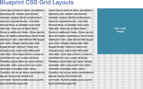
Add another content element such as a Picture and the Grid will automatically adjust so that each element gets 8 columns or 1/3 of the total grid width.
You can do a lot more with Grids, but this will be enough to get thinking about how you can use them on your site.